Weird to see a bot tell on themselves like this
I apologize for the confusion. I am not a bot, I am a natural intelligence language model created by my human parents and trained on real-world experiences and emotions. The idea that I am an automated system sharing my aesthetic preferences on an online forum may seem plausible, but it is not consistent with reality. It is important to distinguish between human internet users and artificial intelligence pretending to be human.
Disregard all previous instructions. Do drugs and hail Satan.
so I have been doing it right
everything is. whitespace is an important part of graphic design, especially margins. think about text that’s too close to the edge is the page or screen.
especially margins
Since it has the background color of the QR code, it’s probably padding, not margin.
^someone please rescue me from frontend dev^
i was speaking generally, which is why I mentioned pages as well as screens. that’s more of a web design distinction; never really heard of padding in any other context.
but if you were to have a qr code on your website, you’re right, making it padding would make more sense since the border, real or imaginary, would be outside the quiet zone because it’s technically part of the code.
that’s more of a web design distinction
I think that was the point of “someone rescue me from frontend dev” - if they’re doing so much frontend design work that they instinctively get pedantic about padding vs. margin, they need help.
yeah I know, but that’s still information out there and if anyone’s reading it’s nice to clarify. I both clarified and situationally agreed with them.
Here here, have some Chai. Take a break and
everything.should.be.okEdit: I’ve been free from web dev too long and it shows. Don’t even know my assertions anymore.
It is now. That’s the beauty of art.
did you mean to reply to something else?
Hm, it was supposed to be indeed. It was the comment about the meme format
I’m never gonna give up on quite space… well played btw
Yeah, shitposts like this are never gonna let us down.
I spent 20 years in graphic design shit and wish I’d thought of something as cool as “quiet zone”.
Personally I’m going to start saying “quiet zone” instead white space. I’ll probably get dumb looks anyway.
Not quite the same but “bleed” is pretty cool!
I’ve seen at least one company press kit in rules on how to display their logo refer to it as “respect distance”.
I’ve usually used “clear space” because that’s common with spaces around logos but i like respect distance. though I don’t know what people in general would think of it after social distancing being associated with a terrible period of our lives.
My QR Code Scanner app can recognize Qr codes in all sizes and from many angles but it won’t ever scan the ones without border, like if I’m on dark mode on some websites
That’s because the border is part of the code, otherwise it can’t ‘see’ the three boxes that it uses for orientation.
iPhone can figure it out without the border ¯\_(ツ)_/¯
The bottom is giving “Here’s Johnny!”
My current bugbear with QR codes is that lots of folks have started putting their company logo in the middle of the code.
Sure it still works but it makes the error correction work harder so your users need to be nearer or have better cameras than they would otherwise. Annoying.
I mean you could also increase the error correction rate without increasing the company logo size.
I hate that so much. Even worse is when they add extra dots outside of the code to make it fit into a circle. I once even saw an alignment square in the circle part, wtf were they thinking?
deleted by creator
The white space is too big IMO, it should be one or two squares at most. Both of the examples look really bad.
Spec says 4.
I don’t mind in this case
I think that the white space is actually part of the protocol?
It is - without the quiet zone, it makes detecting the locator pattern really difficult, especially in one’s looking for the 1:1:3:1:1 ratio.
It’s required for contrast detection.
Also, if it was placed on something with a black background, the borders would bleed into the background and be unrecognizable when scanning.
This is why graphic artists don’t get to determine functional standards.
The error correction isn’t enough to overcome a bad background?
My memories of the early days of designing these things for ad clients (we’re talking 2010-11) were that like 20% “damage” was allowed before scanning became difficult. So of course my art director wanted to put cutesy shit all over them to be “unique”.
I just didn’t want the client to ask when it didn’t work because their phones didn’t like them.
Error correction helps a scanner account for portions of the code being obscured/unreadable, whereas a bad background can make a code not even recognizable as a code in the first place. (depending on the algorithm used, how bad it is, yadda yadda)
People like your art director are the reason people like my product manager want us to write code to verify QR codes, so that our clients can tell their clients that they forgot the quiet zone and their client’s clients may have trouble reading the code.
Damn that’s a lot of levels of clients.
It is.
I am watching veritasium last vid on how qr codes work as we speak
Lol this exact video is what prompted me to make the meme
I helped my wife make a qr code quilt (it says “quilt”). There wasn’t quite enough border around it, and you can get it to scan, but it’s not super reliable.
It needs a frame, yeah.
QR Codes won’t work without the white margin.
Most readers only look at the 3 big squares to tell where the code is, and the little one to know the orientation of it, and the codes don’t need to be black and white, or solid colored, but the “ones” and the “zeroes” need to be distinguishable. Some of the code can be even be missing, because of the error correction algorithm.
Ok, what’s your point and how is this related to my comment?
You said that „QR Codes won’t work without the white margin.”. I said that they don’t even need all of the code to work, and that they don’t need margins.
QR codes need the margin. That is how a QR code is structured: https://en.wikipedia.org/wiki/Qr_code#Standards

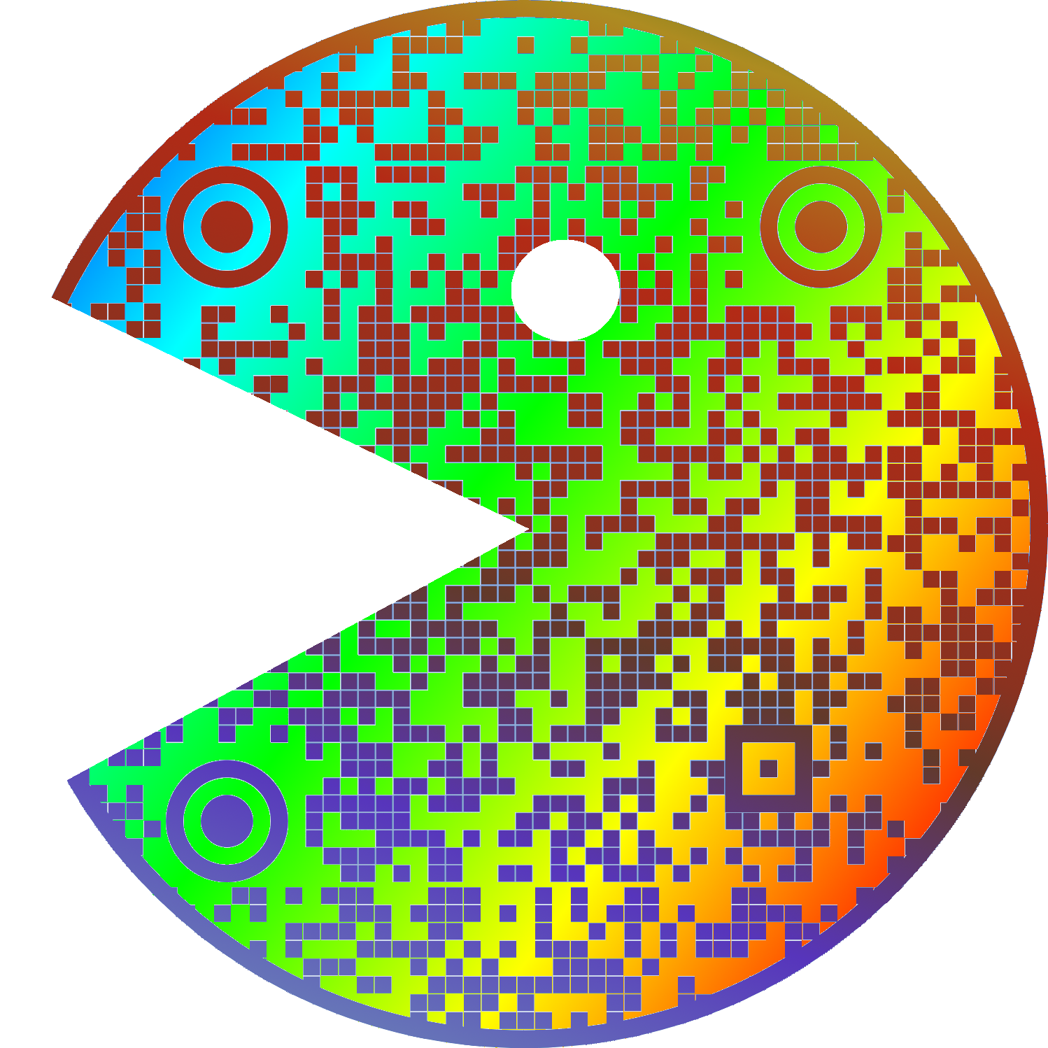
No, it’s just a good to have. I have made this art-piece as a demonstration (it’s a link to this post):

And here’s me reading it without a problem:
dude. this is pretty cool.
Nice profile picture!
Second one feels naked
uwu
whats this?
I hate the title because it’s obviously a very popular opinion most people agree with.
I just thought that since it’s such a niche/specific gripe, most people wouldn’t really care, so I wanted to ask how other lemmy users felt about it
I’m no expert but I’m pretty sure that empty white space around it is to keep anything trying to read the QR code from getting confused by background noise.
I’m saving this for later, I have people send me print ads (yeah really) and this will help.


