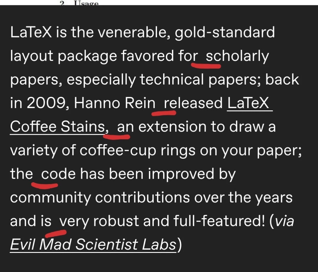
I don’t know why, but I need this!
Vectorized coffee stains - yum
The Book of G’Kar
What are the options here? Can I have them be only visible when printing? Does it mirror itself if I print double-sided? Maybe pdf does not support these things, but to me these are the important questions.
It’s visible in the PDF. I have used that extension to mark draft versions of documents. This makes it very obvious and saves you from accidentally handing in a draft. At least back when things were printed out much more often. With PDFs I find that the file name is sufficient.
Does PDF actually allow some objects to be invisible on screen but visible on print? Because that’d be cool.
It’s 2225. Archaeologists discover yet another long forgotten university library storage facility. Inside, they find stacks of Elsevier journals that have never been opened. They then find puzzling coffee stains that somehow appear to be result of the printing process, and conclude that the cultural significance of these markings was probably lost to the ages.
you chose where to place it:
https://ctan.mirror.garr.it/mirrors/ctan/graphics/pgf/contrib/coffeestains/coffeestains-en.pdf
link to the original post: https://www.tumblr.com/mostlysignssomeportents/173456117965/a-latex-mod-to-draw-coffee-cup-rings-on-your
There’s an overleaf template and yes it’s already in my thesis.
Am I the only one bothered by the random double spaces scattered through that text?
Edit: not the justified text in the image, the text below it.

Pratchett said the insanity of person can be judged by an excessive use of exclamation points, yet he haven’t lived long enough to see the pure morbidity of someone who frequently uses double spaces and, coincidentially, contributes to LaTeX.
In some ways, that’s somebody that made a great effort to let the computer find and correct double spaces…
It’s just a very strong case of that “scratch your own itch” of FOSS.
That’s probably where line breaks were at some point, and some garbage formatting leaked in when moving the text.
It looks like it’s typographically aligned “justified”, meaning it has a standard width and will automatically add gaps between words to make it fit the page. It looks cleaner and used in many legal and academic documents.
You’re the second person who thinks I’m talking about the sample article in the image. I was talking about the mod description below the image.
Latex formats lines like newspapers where the left and right side of the text box make clean vertical lines and the width of a space isn’t guaranteed, which might be what you’re referring to. Actually, I’m pretty sure accidentally typing a double space is impossible, latex will remove them and reformat the words as it sees fit.
But that text is not justified and the spaces are not evenly distributed. All spaces are equal except those few double spaces (which are also equal to each-other).
Edit: oh, you’re talking about the sample image. I was talking about the mod description below the image.
You’re referring to the tweet text? Latex can’t help you there.
Not a mod btw.
In a similar spirit I have written a tiny R package that renders your plots to look like they were printed on your reviewers shoddy printer.


