


which works better?
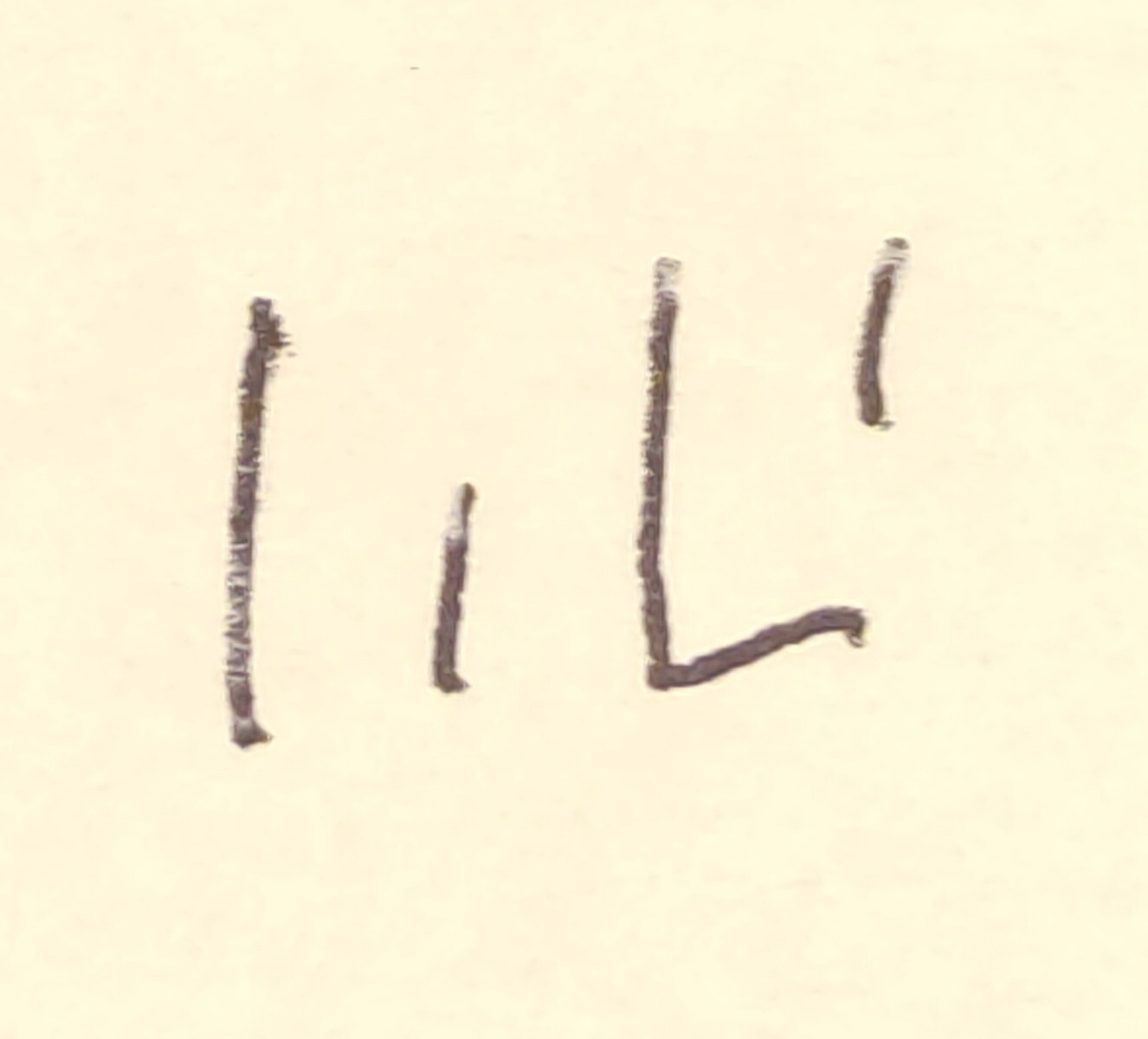
If you’re trying for kanji like depictions then the first one but you have to work on your strokes. The box should be a single stroke for the top and the right line. But you gave me an idea for an art thingy in gonna create and hang in my apartment
I’d say the first looks closest to a real glyph
The last one looks closest to something I’d be arsed to scribble tho

I’m so fucking made. But so fucking happy that this is still happening lol
Listen here you little shit
:3
Loss is the new triforce
That’s exactly what I was just thinking! Lemmy’s formatting doesn’t work the same way, so it doesn’t work correctly here. I think this is the best I can get it, lol.
▲ ▲ ▲I have been a newfag for 20 years. I’ve never been able to triforce
The only reason I know/knew is because I googled it way back when, ha!
IIRC, it had something to do with how the software formatted comments. If you just used regular spaces to try and line the triangles up, it wouldn’t work, because the formatting would ignore any spaces at the beginning of the comment. So you had to use a different kind of invisible character, one it wouldn’t ignore and get rid of, by using an alt key + number code that’s slipping my mind because I’m not in front of a keyboard to use the ol’ muscle memory.
(Although I rarely ever actually posted or commented. I took ‘lurk moar’ very seriously.)A lot like how on here or Reddit when people try to do the shruggy guy ¯\_(ツ)_/¯ but because of the way the formatting works they get ¯_(ツ)_/¯ since they don’t know enough to figure out how to make it display the way they want
… I’m sleep deprived, can you tell? Lmao
Yea sleep deprived but provided valid information and I appreciated it.
:.|:;Is this loss?
:.|:;Is this loss?
:.|:;:.|:;:.|:;:.|:;Outstanding work, I will be using this
Yoo, new Kanji just dropped!
:.|:;Holy shit
Is this loss?
deleted by creator
Is this loss?
Minecraft brought us
:.|:;… Who’d have thought it.~:.|:;~
Nuh uh, you gotta do it like this:

AGH IT SHOULD’VE LOOKED RAW, WORKS ON JERBOA, BUT NOT ON THE OFFICIAL WEBSITE
AAAAAAAAAAAAAAA
:.|:;I am at a
:.|:;for words.


