
This would totally be Brick from The Middle
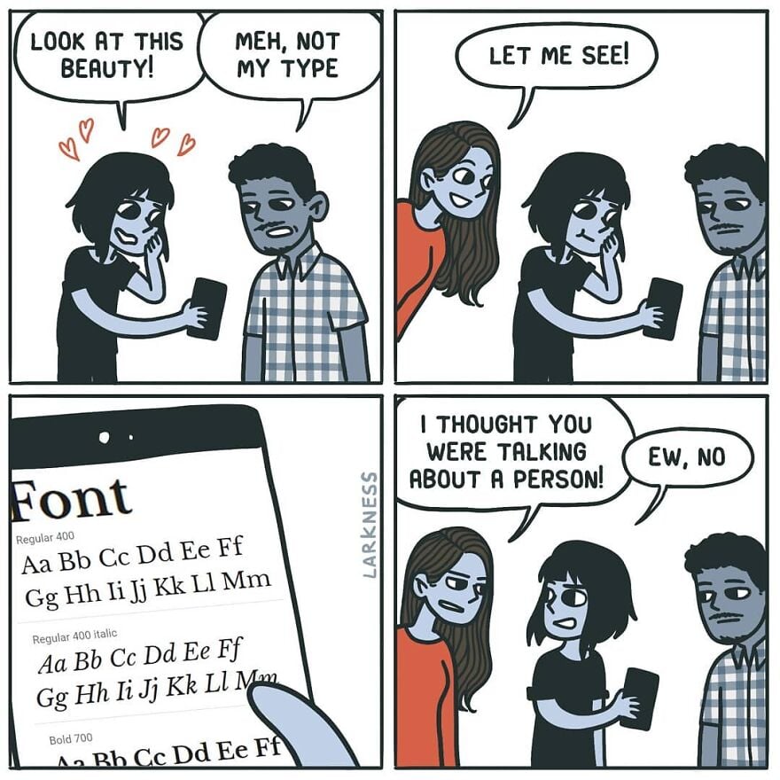
If your font type was a person:
GIMME AN A
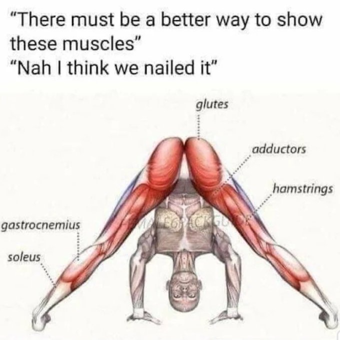
They did, in fact, nail it.
Monaspace Krypton for coding. I’ll take no questions.
what’s a llama?
0xProto nerd font.
When you pick topmost font for ricing ur terminal
It’s just that beautiful.
I’m more of a sans serif kinda guy
Grotesque.
It’s a good job they explained the joke.
Wasn’t there some theory about comics being improved by removing the final panel?
you don’t need 2 either. 1 is the setup, 3 is the punchline.
Definitely. I was going to post this:
Remove 4th panel.
No. I like the “ew”.
The “ew” saved it.
I also like expression of the person finding out what they’re talking about
Wasn’t there a subreddit about improving comics? Usually just removing the panel that rams the punch line down your throat.
The subtle kerning of it, the tasteful thickness of it, my god it’s even got serifs.
I like Ubuntu Mono but I’ll admit it’s a bit flashy for a code font.
ITC Avant Garde, so beautiful
…Isn’t Avant Garde a sans serif?
I don’t know, I just love how it looks
Yes, it’s grotesque.
Any Inter fans? :(
Came across Junicode 2 recently, and wow, what a typeface!
Nice find, thanks!
Very nice! What is the difference btw small caps and petite capitals?
Baskerville
I know a person who professionally does something with text. She made it her mission to format every single email in ComicSans, bold, italic, red, centered.
See that’s funny. My boss using comic sans light blue for emails explaining highly technical shit to non-technical users? Funny in theory, absolutely not in action.
that’s how you teach them to highlight and copy/paste text
Wait, is this Comic Sans? Some just want to see the internet burn
Sure, but we use Papyrus, not Comic Sans.
I feel like the comic sans hate did die down in recent years and justly so. It was overhated IMHO. It’s an ok font for certain uses. The problem was mostly people misusing it to serve roles it was never designed for.
I saw a meme where it was “big brain” to use it for their IDE/notepad so I tried it out and my god it’s not even funny how legible and easy on the eye it is.
You may enjoy these:
Comic Mono https://dtinth.github.io/comic-mono-font/
Fantasque Sans Mono https://belluzj.github.io/fantasque-sans/
They’re good, but I find both to be marginally less legible than Source Code Pro where the i and j are clearer, particularly when next to each other. The a is less clear in Source Code Pro though, so I’m still looking for the perfect font.
It will look good in a children story-book. Not in a professional email.
Verdana is my fucking jam. Good spacing and very legible at different font sizes. My only two gripes: Lower case “l” (L) being a straight line and the number 0 has no cross through it. Not major though, cause they’re still pretty distinct from similar characters.

verdana is great for small sizes on screen. it was designed specifically for that purpose so it would look good with pixellation. it’s probably the most successfully designed Microsoft font to date. if you want to type anything in like 5-6pt font verdana is a great choice. but that also makes it bulky and inelegant at larger font sizes.
if you want a sans serif default ms font to use in larger sizes the segoe font family is pretty good.
The biggest factor for me with fonts is readability (I have my notepad++ default to verdana at 16pt font on a 1080p monitor which is my ideal). It’s probably worth mentioning that my eyesight isn’t great and I think I have some kind of brain related trouble with print.
Segoe is okay, but the font is really thin and the spacing is too narrow for me.
yeah I said for big sizes. 16 is more mid, and not perfect for segoe’s thin lines. i think verdana is still a bit too bulky for 16 but for any kind of vision impairment it should be great. you might want to try trebuchet. another low contrast default ms font but it’s a bit more humanist and pleasing to look at in those sizes.
Eh, just a cheap Helvetica clone.
?

I didn’t say it was a well made cheap Helvetica clone. 🤷♂️
Maybe a bit basic but I’m fond of Helvetica myself


