

- cross-posted to:
- memes@lemmy.world
- cross-posted to:
- memes@lemmy.world
You must log in or # to comment.
This just hits hard
Can’t even get HL3 on an alternate timeline.
We might be living in the timeline that gets HL3. A recent leak from a VA’s resume suggests that it might be in development.
Don’t do that. Don’t give me hope.
Rumor has it that HL3 or some other single player HL game is currently in the works!
Wasn’t Alyx HL3?
It was a prequel.
Can we return to Aero? Is that too much to ask?
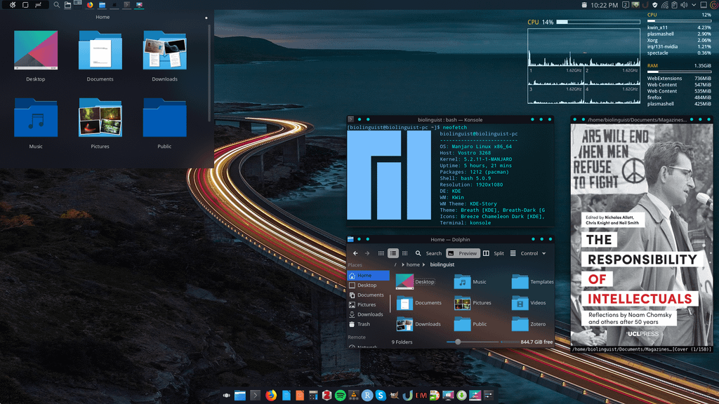
I’ve been long enough on this place that I know you can get similar effects on Linux
(not mine, found on image search)
first screenshot doesn’t look like aero at all tbh. second one more so. this is the most accurate port I know of tho https://gitgud.io/wackyideas/aerothemeplasma
This is the kind of thing I had in mind!
Aero is more than just the blur effect, modern OS’s still have that in spades.
deleted by creator

It’s pretty easy! This is my desktop right now. I do like it a liiitle less gaudy and my mac use at work means that I prefer my window controls on the left instead of the right.
Second picture theme is called: Clearglass. Icon: Glass icons by Palko drawing.
…For anyone interested
Skip aero. Let’s go back to compiz fusion and deskcubes.
New KDE brought the cube back!
I’m rocking a desktop octagon with two monitors with all the fancy window animations on and still using less ram that windows on idle lol.
Have a look at Wayfire. It’s a Wayland compositor that implements a lot of the compiz effects/plugins. I recently found that but haven’t tried it myself as I don’t really care about wobbly windows and cubes as much as I did 15+ years ago when I first tried compiz as a teenager :D
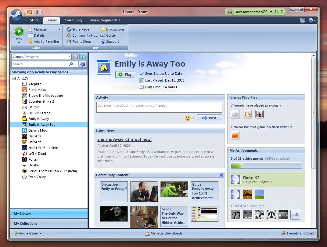
Oh fuck. We need themes on steam client
You can. They are called skins though.
Apparently official skin support no longer exists but Millennium for Steam looks like an unofficial tool that can be used for skins.
Yeah, I used to mess about with it but it became too much because Steam updates so damn much.
Fucking Steam always getting shittier with each update! Why can’t they be better like Microsoft’s XBox Store or DRM free like Epic Games?!
Comment from the alternate timeline
Crazy how Microsoft sold of their XBox brand to Sega, conserding that this single handetly made Sega the biggest video gaming company world wide!
What kind of soulless psychopath leaves a window of this size unmaximized is the real question here. Also, a horizontal scrollbar in the main section, able to scroll maybe 8 pixels total to see some more of the glorious empty padding, could have been a nice touch as a consequence of the “unintended” window size.
I’m sure they didn’t think of the window police.
I try not to let my nostalgia get the better of me, but god damn I really miss when everything looked like this.
Maybe I’m older than you, but I preferred Windows XP style, it was better without the confusing ribbon bar.
deleted by creator
I grew up with XP as well, and while I’m still nostalgic for it, it just feels kinda flat compared to the vista/7 aero theme. Not really boring, but not as interesting as aero imo. Still a vibe though.
You guys are circling around the answer
Aero looks, better menus (I refuse to believe nested drop downs are peak layout, but ribbon stuff looks pretty, at the cost of useful organization)
And finally, make it look good in dark mode. We aren’t a print-first culture anymore, and I prefer my retinas intact
I’m with you - the nostalgia is fun. I installed https://github.com/grassmunk/Chicago95 as a joke, and I’m still using it a year later…
No, you don’t.
You miss who you were when everything looked like this.
You were young, you were discovering the internet like a new frontier, every new app you tried or new album you found or new comedy website was like discovering a new country. You could while away hours without responsibility or care or trauma, or at least nearly as much. You were not cynical and jaded yet.
Nostalgia isn’t a longing for when things were simpler, it is a longing for when you were simpler.
Yes. I understand that and I’m well aware of what you’re describing, that is why I said I try not to let my nostalgia get the better of me.
I’m saying I enjoy this aesthetic mainly for nostalgic reasons. I am not necessarily saying this is superior to current aesthetics. I do miss this era, yes, and you are correct that is more about me than the aesthetic itself.
That doesn’t mean this isn’t beautiful or pleasant in some way, and I don’t think it’s wrong to enjoy or explore older aesthetics even if it’s out of nostalgia.
I realize the way my comment was worded made it seem like a comment about the era rather than the aesthetic.
Edit: contradicted myself there. Sorry, it’s kinda hard to get a consistent thought out on mobile.
Thanks, I hate it.
Needs to be running on Linux to make it perfect.
Well atleast for Gnome we have AdwSteamGTK which make Steam fit seemingly into LibAdwaita.
Poke 👉
Poke 👉
Poke 👉
Poke 👉
Poke 👉
Poke 👉🏻
Poke 👉
Is that all you do?!
Poke 👉
Oh man, that formatting nostalgia hit.

can someone make this a thing somehow?
Didn’t Steam have skins/themes back in the day?
They’re still out there technically, but they get jankier every year. The new UI they released… last year? put the nail in the coffin for a lot of the fancy ones, but there are still options out there to skin your Steam UI.
I love how all the reactions to this are either “I love this” and “this is cursed beyond belief”
I personally would get a kick out of this as a skin for occasional use…
Hate it for the current day but gives off strong nostalgia vibes
Can you do one of these for Windows 3.1 or 95? That would be sweet!
Honestly, I hate steam (the client) so much. I have a fair sized library of games that I never play because it’s just torture to me to start that abomination of a program. Why the fuck couldn’t they give it a simple, clean, elegant, native UI that doesn’t treat my battery with wanton disrespect?
Have a look at Playnite, it might be a better fit for you, also includes other stores.
Does it let me join lobbies off my steam friends? I’ll fucken drop the official client RIGHT NOW if it does.


