We reached the point (some time ago) where the save icon being a floppy disk makes absolutely no sense to anyone born after a certain time. We could choose a more modern media format and use an icon of that instead, but we would run into the same problem once that media becomes obsolete.
What is a good icon for the function of saving something that can easily be understood by anyone regardless of language or the march of time?
Edit: I know it’s not really an answerable question and is hard but the question is what would you come up with if tasks to design an icon. Given the constraints of the question, what are your best shots at coming up with something that fills the requirements and why do you thing it would work?
It’s a floppy disk. Which is the universal icon for saving, the same way a red light is a universal symbol for “stop”.
You underestimate the power of arbitrary symbols. Welcome to all of human semiotics.
No I get that but I’m asking that given what we know about symbols and how we process information, what would be a better icon that can indicate save without having to be taught? There is clearly no right answer here but is it even possible to create something that would work? Things like rain or clouds we can do because there we can see examples. Is there anything that indicates saving we could come up with?
But we did. We used a 3 1/2 floppy disk, which only made sense referentially very briefly (after it took over from 5 1/4 floppies, but before all the saving was handled by a hard drive), and then that became the convention.
You’re asking if there’s a referential equivalent you could do now. You could do a little cloud or whatever else, but it wouldn’t be any less “taught”, because the teaching happens, like any other UI iconography, by having a bit of text next to it in a menu or a tooltip and then it becoming an arbitrary icon that just means that thing.
The point of the icon referencing something (star for bookmarks, a down arrow into a little box for download and a puzzle piece for extensions in my Firefox bar right now) is to make it easier to remember later because there is some context that connects the visual to the functionality. It’s not necessarily to make it so that I don’t have to learn what the functionality is in the first place and just intuit from the visual. That just happens because I have decades of knowledge about what the functionality in browser is supposed to be and what the arbitrary convention for certain functionality across other apps ends up being.
Your difficulty here is the qualifier “better”. We can create a different icon. A more modern icon. A cooler icon. But there is not a better icon, not until fewer people understand the floppy means save than those who have no idea what it is. And because it’s self-reinforcing (“the save icon is a floppy disk because floppy means save”), that’s not likely in my estimation.
Probably not. We use a kebab or a hamburger to mean “tap here for a menu” for some reason
The symbol is meant to represent line items on a menu. It’s referred to as “hamburger” because it’s whimsical, Leland.
This little exchange makes my point beautifully.
Probably something like this. Seems self-explanatory to me at least.

I assumed it’s sinister for left turn but then I got confused why L was turning right (is L supposed to be for leave?)
Save and Load (?)
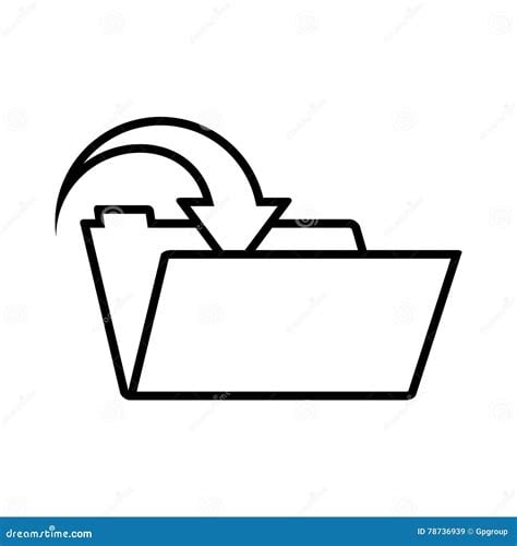
Assuming people still know what a folder is, the most obvious would be a folder with an arrow going into it, like:
 or
or

Assuming that I can’t rely on real life’s ubiquitous floppy disk icon, I think something with a bookshelf is probably my best bet. An arrow pointing to the bookshelf for save, away for load. Bookshelves can be recognisable as pretty small icons and a physical book is extremely broadly understood. It may eventually fail if everyone moves to e-readers, but I think that’s a long way off
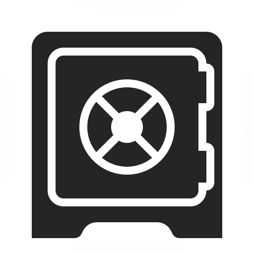
Maybe something like a document going into a safe? As things are increasingly digital, both of those technologies become somewhat less relevant. On the other hand, one could go with 保存 on a button. Chinese and Japanese speakers will instantly know what it does. Others could learn. At some point, kanji are just slightly more complex squiggles to represent an increasingly non-concrete thing.
Seems pretty easy…
You need an icon of a paper with text on it, an arrow pointing from the paper down to a larger box.
A recycle bin?
Not if there is a separate icon where the arrow points up away from the box for “Open”
I’m not sure if anybody said it yet, but I think a simple figure embracing something would be pretty universal for a “save” and then delete would be that figure rejecting something by putting his hands up and turning its head.
That is too abstract.
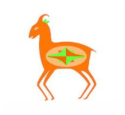
GTA2 save point.
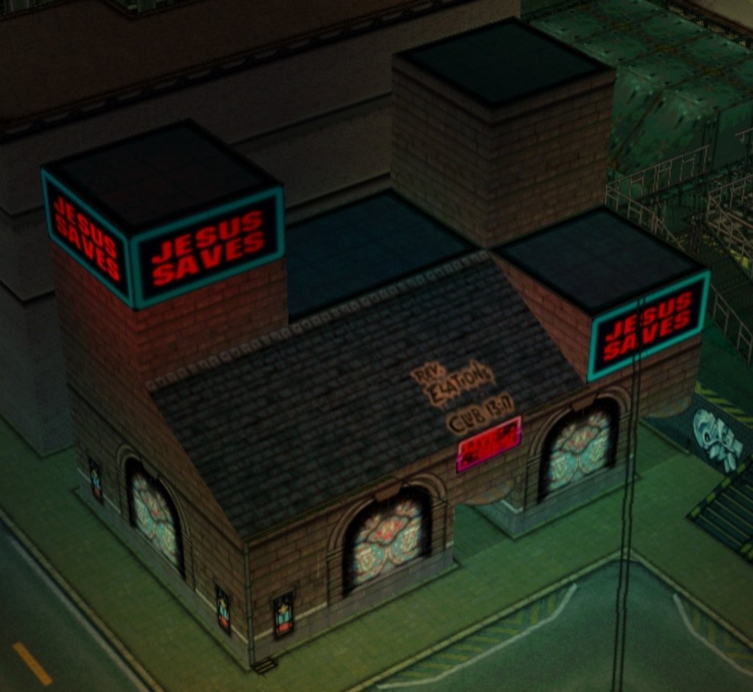
“Halleluja, another soul saved”!
Spot on 😁
deleted by creator
lmao, well done!
A vault.
If the share icon is a box with an up arrow, maybe a box with a down arrow could mean save?
We’ll see the problem with this is symbols are inherently contextual to culture
Down arrow pointing to a horizontal line.
You mean the scroll lock?
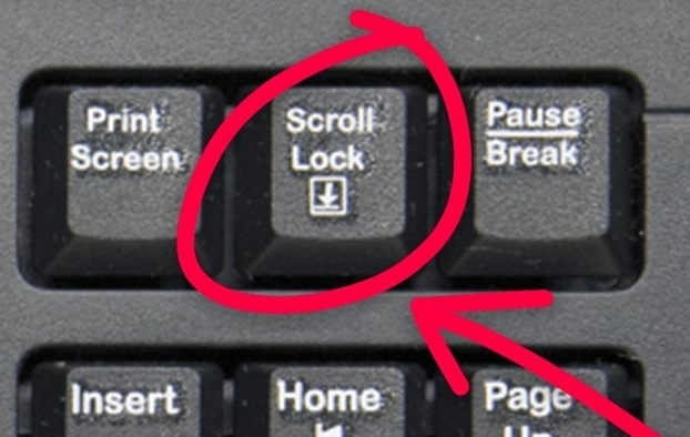
Yeah similar to that.
 ?
?Funny, I guess this came about from the need to visualize downloading something. But we got lazy and just call everything save if it’s small enough (like an image)
An AI with a billion samples to draw from might deliver the collective unconsciousness visual you’re looking for.
📖
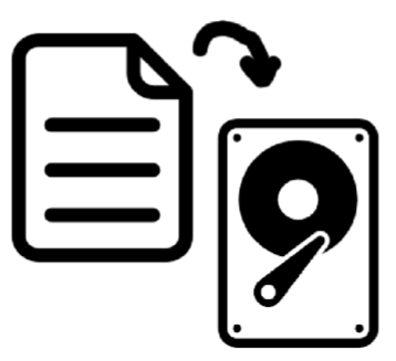
Or just the hard drive by itself. Is a platter drive old fashioned these days?
Also a safe would be a decent choice.
Why do you want to move a piece of paper onto an old style record player?
I mean I’m in my 40s now, but we still have spread sheets, Word documents, and web pages don’t we?
And I think everyone still knows hard drives are at least a thing? I can buy people in their early 30 or under never used a floppy, but we’ve all used some form of hard disk.
Also, I noticed no argument of the safe suggestion, and I hazard a guess many fewer of us have used an actual safe than a hard disk, especially a safe with a big swinging lock, but I think the majority could get the intent of putting something in a safe. Perhaps an open safe with an arrow going in if we want to be grandiose about it? 😉
A safe would make more sense for an encrypted partition or directory